Tomislav Kudric | from Osijek
-
Tomislav Kudric
Game-Inspired, User-Focused
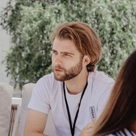
Hi, I'm Tomislav
I aspire to enter the IT world and leave a recognizable footprint with a fresh perspective on the digital landscape. Digital design and illustration have occupied my attention (and free time) for the past eight years, and they've helped me take my first steps toward achieving that goal.I am enthusiastic about deepening my knowledge in the creative fields of design and further exploring the industry. Games have played a significant role in my life since childhood and continue to do so, constantly influencing my work and introducing me to new ideas.Obtained a Bachelor's degree from the Academy of Arts and Culture in Osijek, specializing in Culture, Media, and Management. After completing a UX & UI Design internship at COBE and now working as a digital marketing specialist at Marsa Agency, I continue to combine a variety of skills and experiences that open my mind to fresh perspectives and ideas for future endeavors in my creative work.
Experience
COBE
UI & UX Design intern
JUL 2023 - SEP 2023

During the two-month summer internship, I was introduced to the IT industry and its workflow.They guided us through each step of the process that UI/UX designers follow when working on a project, starting with the research phase at the outset, then moving on to brainstorming, design vision, usability testing and finally culminating in the creation of a functional prototype.I learned how to utilize all the available tools, but most importantly, how to effectively utilize Figma at every stage of the process to achieve the final product.
MARSA AGENCY
Digital marketing specialist
MAR 2025 - currently working
I specialize in creating, managing, and optimizing Meta and Google Ads campaigns.My work involves developing strategies for business growth and online development, with a strong focus on performance marketing. I handle the strategic planning and execution of marketing activities, and maintain clear communication with clients by preparing and delivering detailed performance reports.I’ve learned to analyze the market effectively and develop smart strategies that help businesses grow online.
Advertising & marketing design
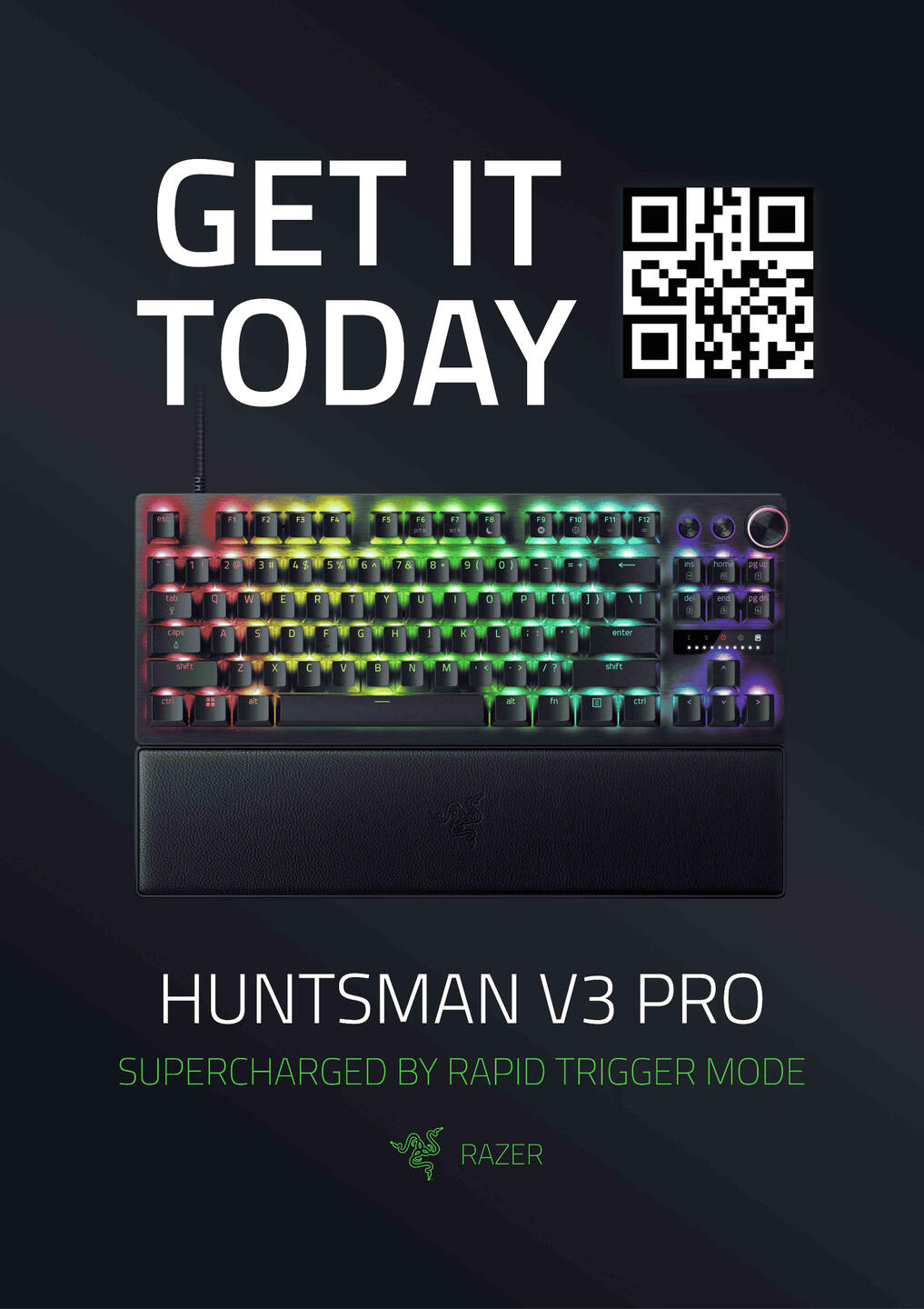
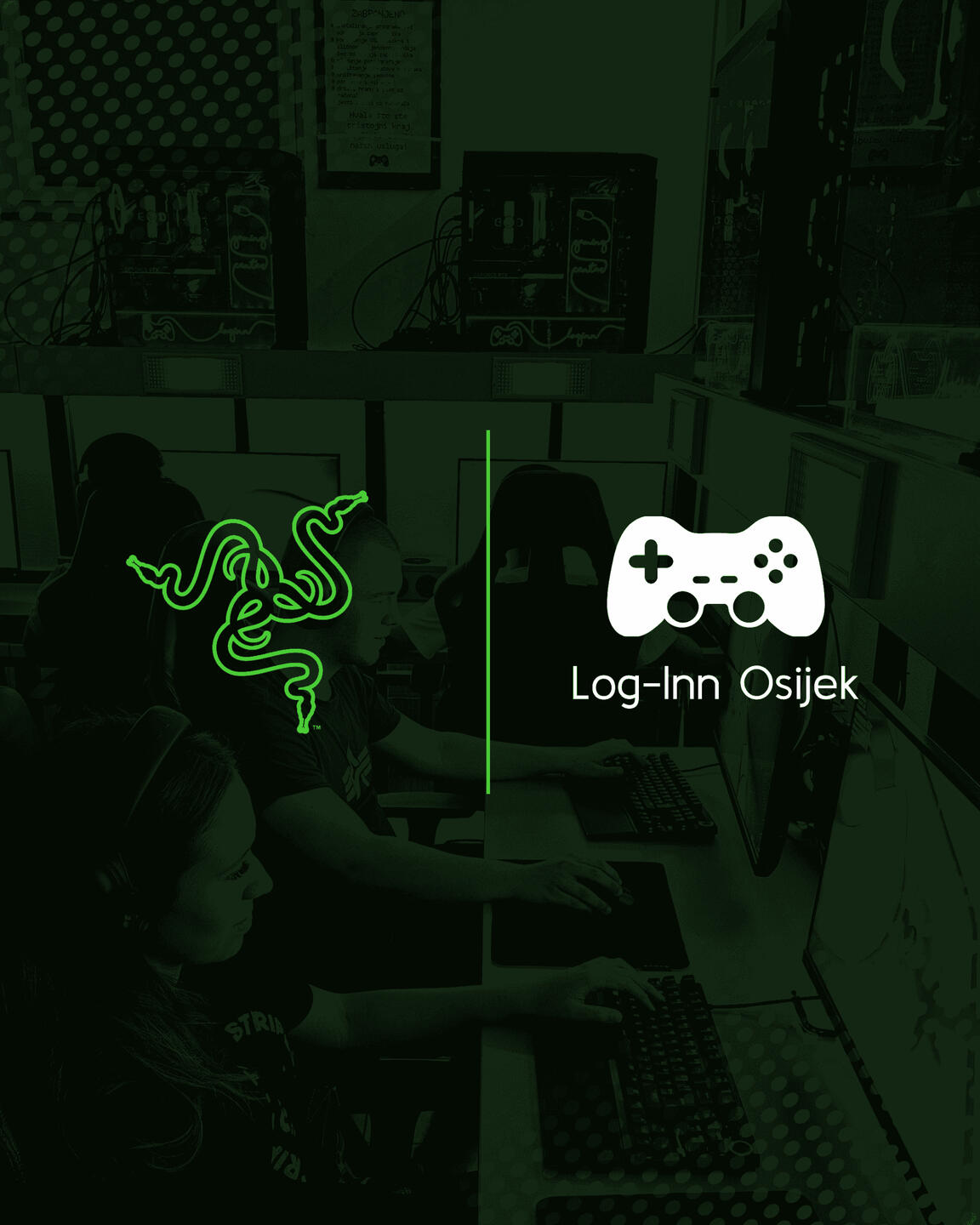
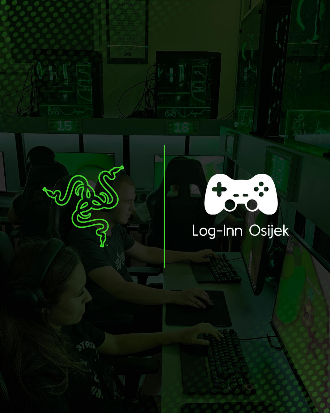
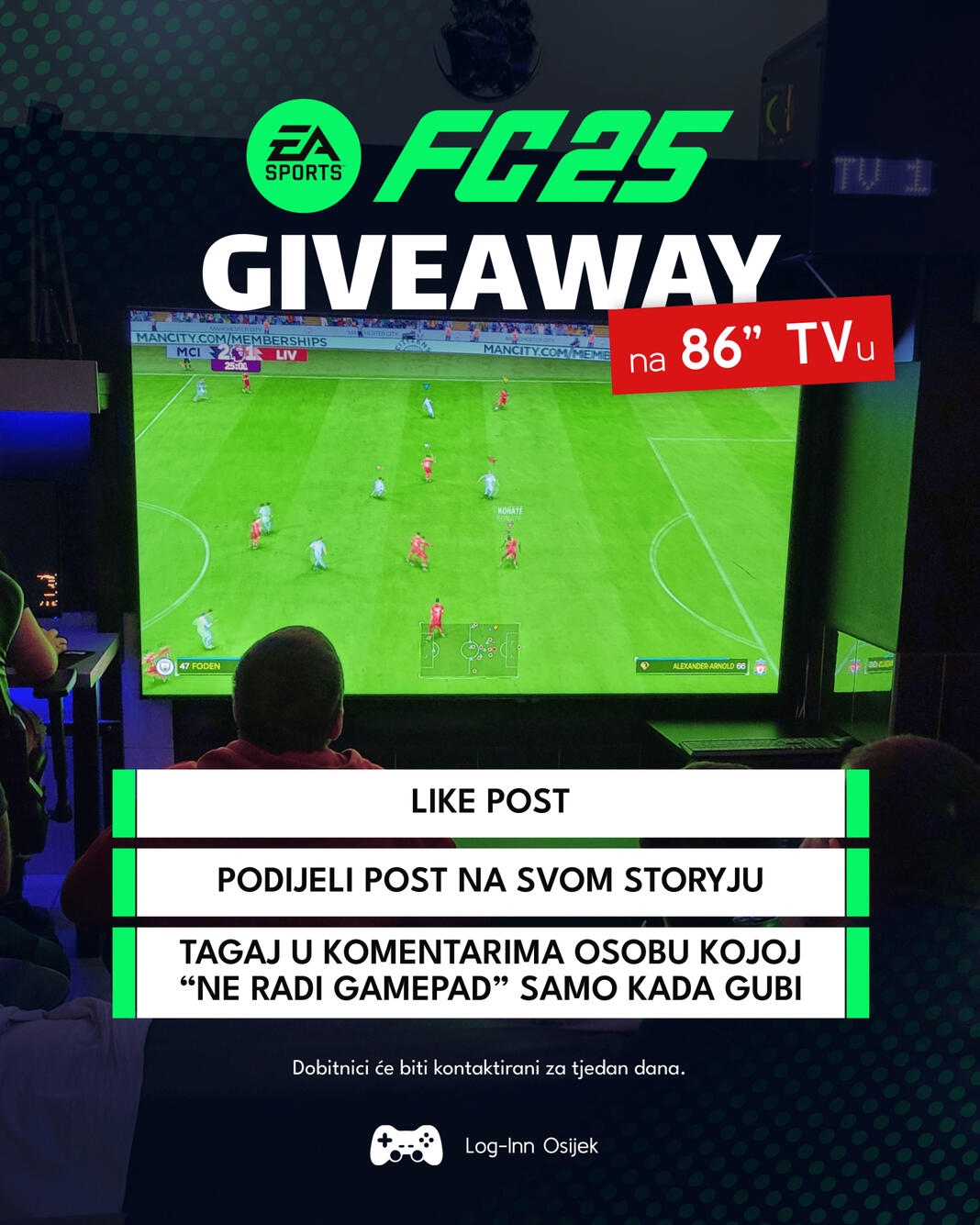
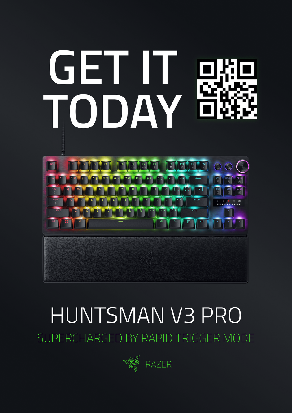
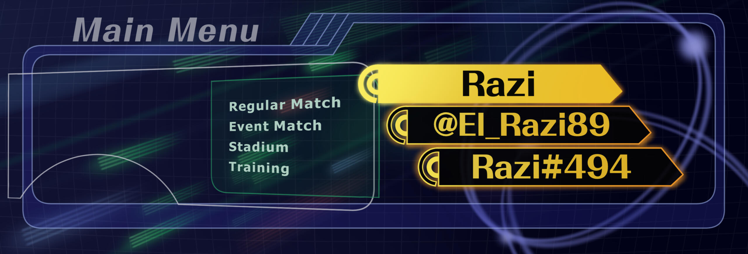
Lately, I've been designing and creating social media advertisements and marketing materials for a local gaming center. During this time, we secured a collaboration with Razer, and I have been working with their design team to develop advertising and marketing materials to promote this partnership.
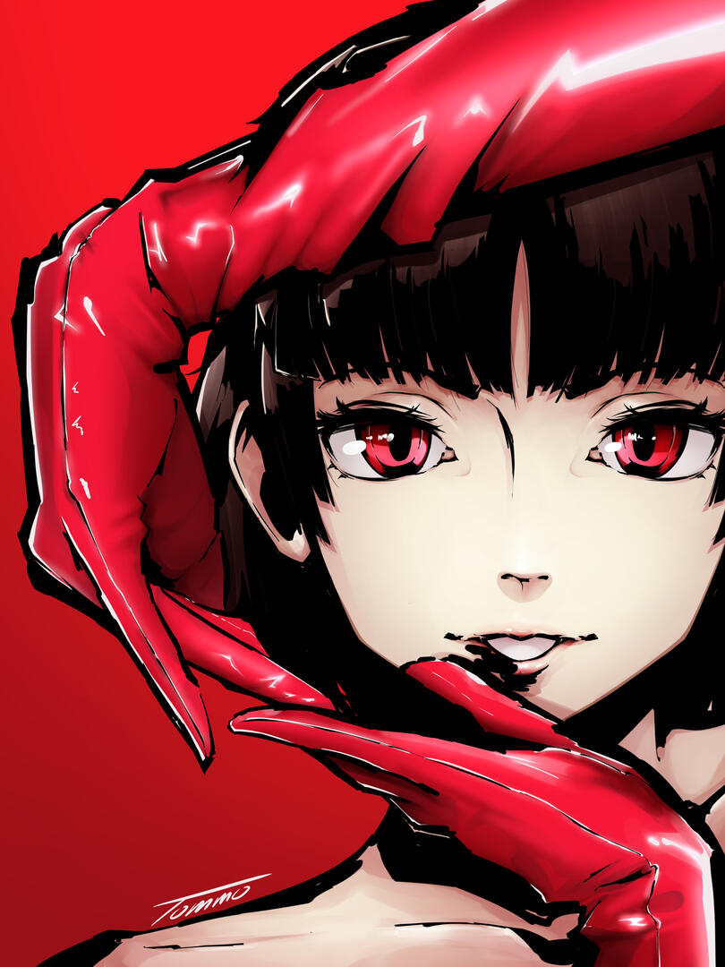
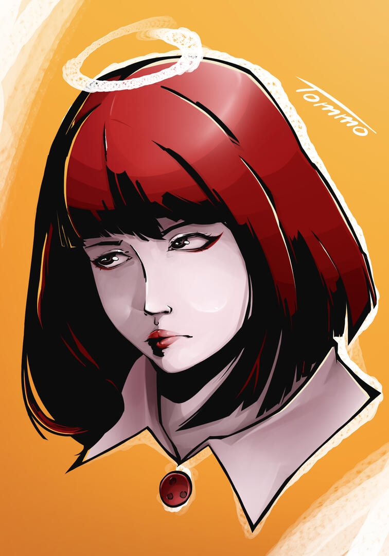
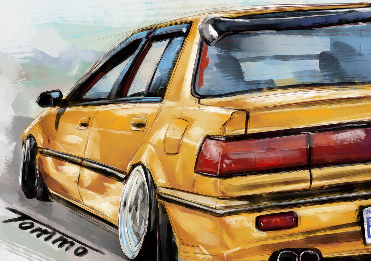
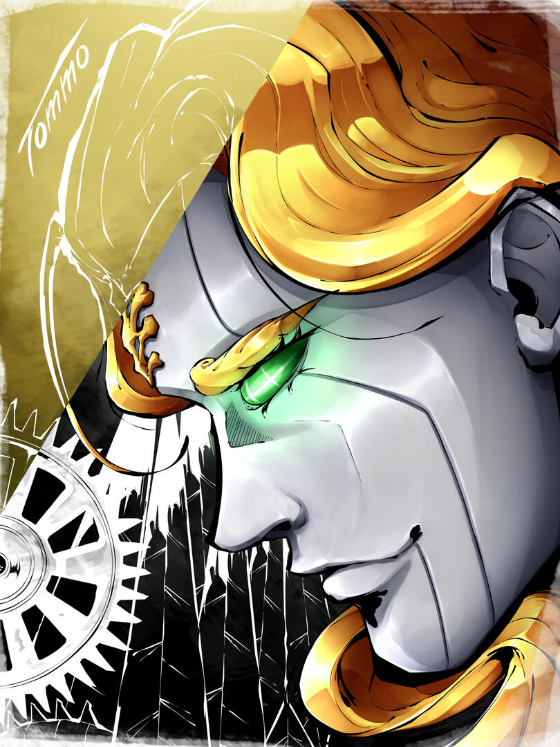
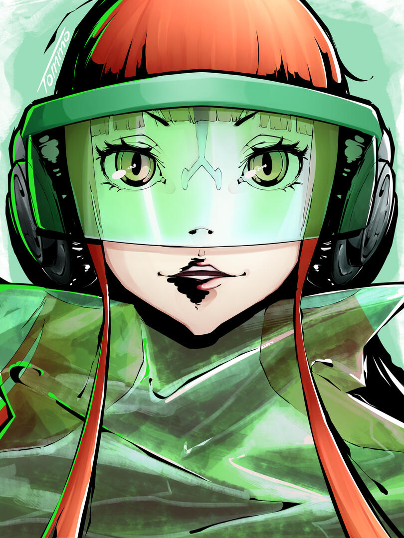
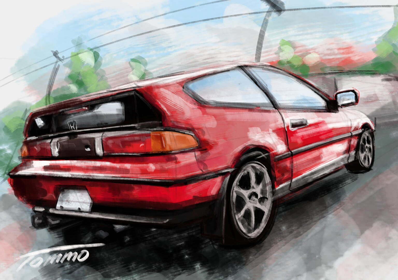
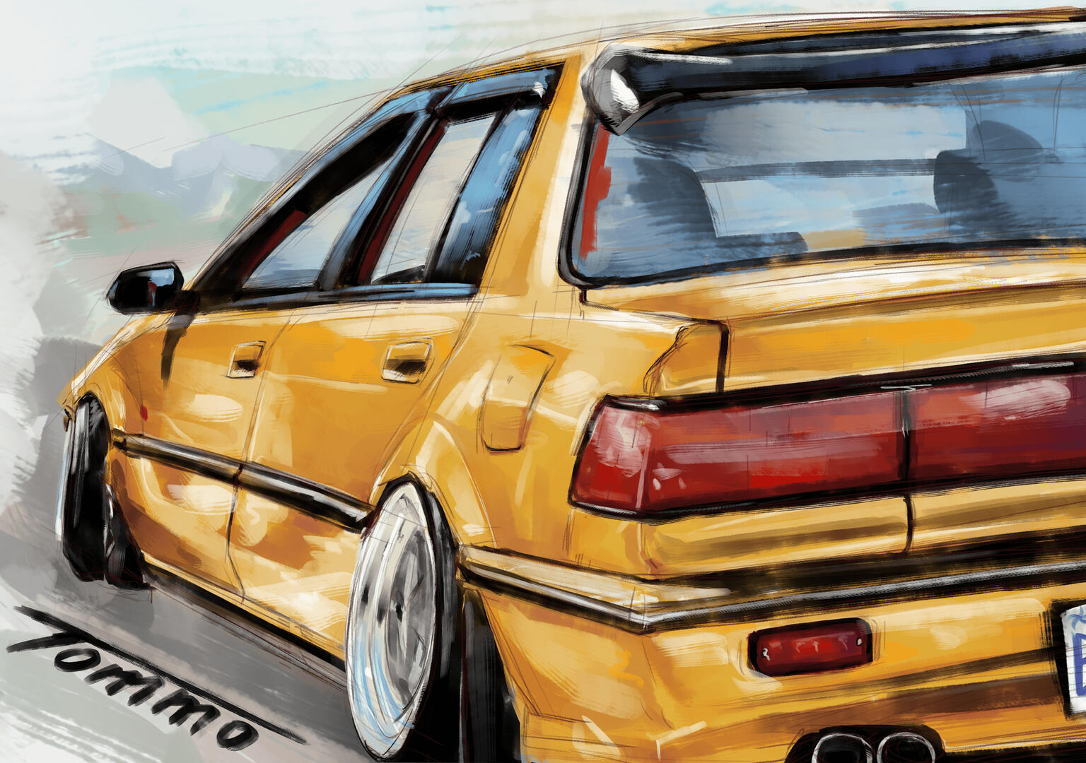
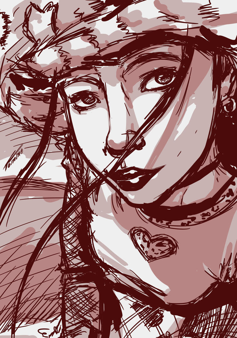
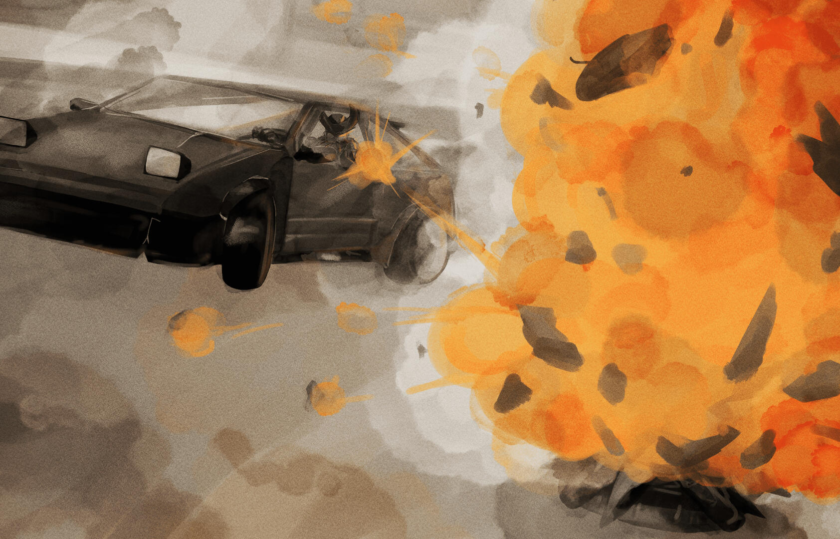
Some of my drawings
Tomislav Kudric | from Osijek

SoundCove
Podcast listening app, I designed together with my college from the ground up, during my two-month internship at COBE.
Advertising & marketing design
Personal Art
Tomislav Kudric | from Osijek
Soundcove
During my two-month internship at COBE, me and my colleague were tasked with making a podcast listening app for mobile platforms. SoundCove is just that, a podcast listening app catered to all podcast lovers.
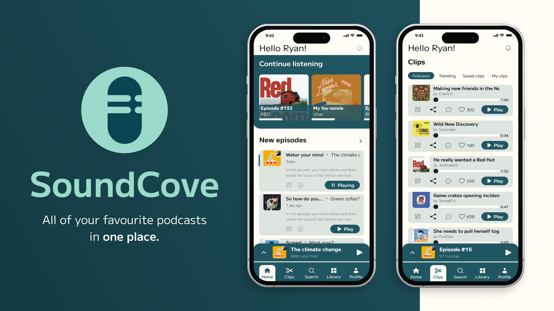
*All visuals were created in collaboration with a colleague
New media is short, podcasts not so much
Our goal for the project was to blend podcasts with emerging forms of media. The podcast landscape boasts an exuberant volume of content, with numbers continually on the rise. Topics cover a wide spectrum, and podcasts tend to be lengthy, while newer, popular forms of media are geared towards shorter attention spans.To bridge the gap between older and newer media, our primary objectives were to:
1. Appeal to both older and newer generations.
2. Foster connections among people and facilitate effortless interaction.
3. Create a reliable platform that also offers a sense of comfort.
My role
Together with my colleague, I designed the entire app from the ground up between July 2023 and August 2023. We conducted research and analysis, collaborated on architecture and flow creation, performed usability testing, created design drafts, and carried out design production.After completing a fully functional prototype of the app, we presented the project on August 30th, 2023.
Share your favourite moments
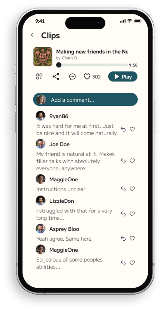
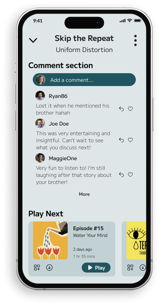
Our vision for SoundCove was to embrace the social aspect of podcasts and bring it closer to the user. Sharing your thoughts in the form of comments was a must have, but what if you could share your favourite moments, topics or jokes?
Introducing clips
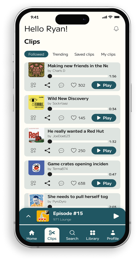
Clips are short, small chunks of the podcast episode that have their own easily accessible section. They can contain your favourite moments or even currently relevant news, and the best part is that anyone can create and share them.It's not just about creating them; users can also explore clips shared by other users, rate them, leave comments, and, hopefully, discover new shows they can dive into for hours.
Beginning
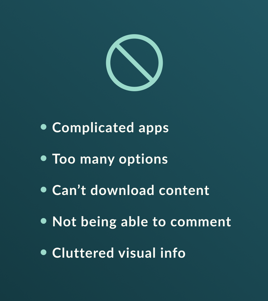
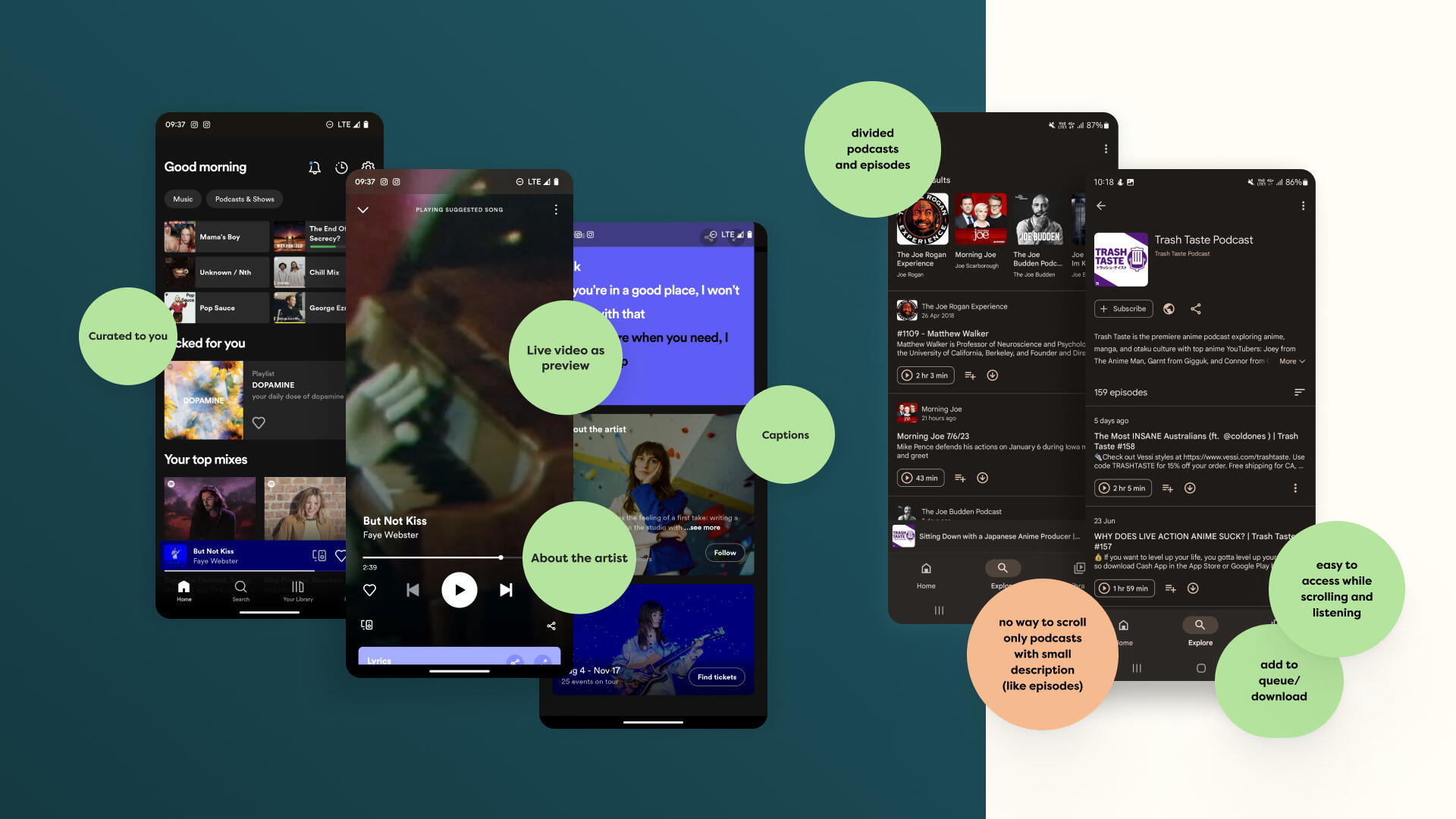
To understand how to start designing the podcast app, we began by analyzing existing podcast apps. We kept it simple by looking at the most popular ones and finding out why people like them and what issues users have.We read lots of app reviews, articles about app popularity, and forum discussions. Reddit forums proved to be particularly helpful because they offered personal experiences and suggestions for improvement.
User's goals
After the analysis, we created two user personas to assist us in understanding the goals and frustrations that users might have. One persona was for older generations who enjoy longer podcast sessions while driving or working, while the other persona represented a younger college student who enjoys interacting with like-minded individuals and prefers simplicity and organization.
Concept and flow
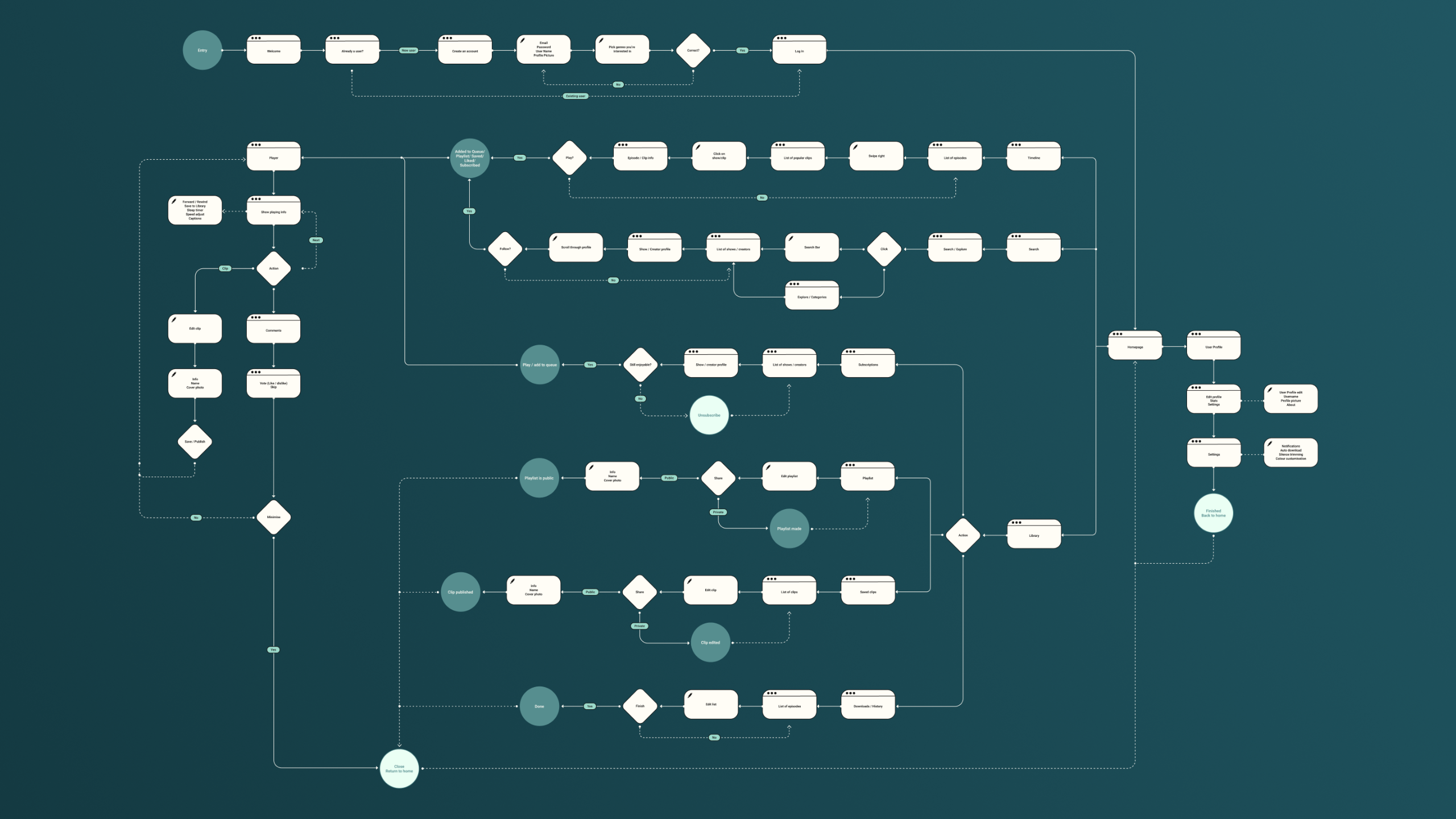
To aid in the conceptualization of the app, organizing the usability flow, and designing the main page layout, we created IA diagrams. These diagrams clearly illustrate the app's flow, how it should function in the hands of the end user, and the main screens that guided our progress.Developing a socially oriented app demands a significant number of features and visible information. To prevent the app from becoming overwhelming, we opted for five main navigation screens, in addition to one for the player.
Early feedback
Wireframe
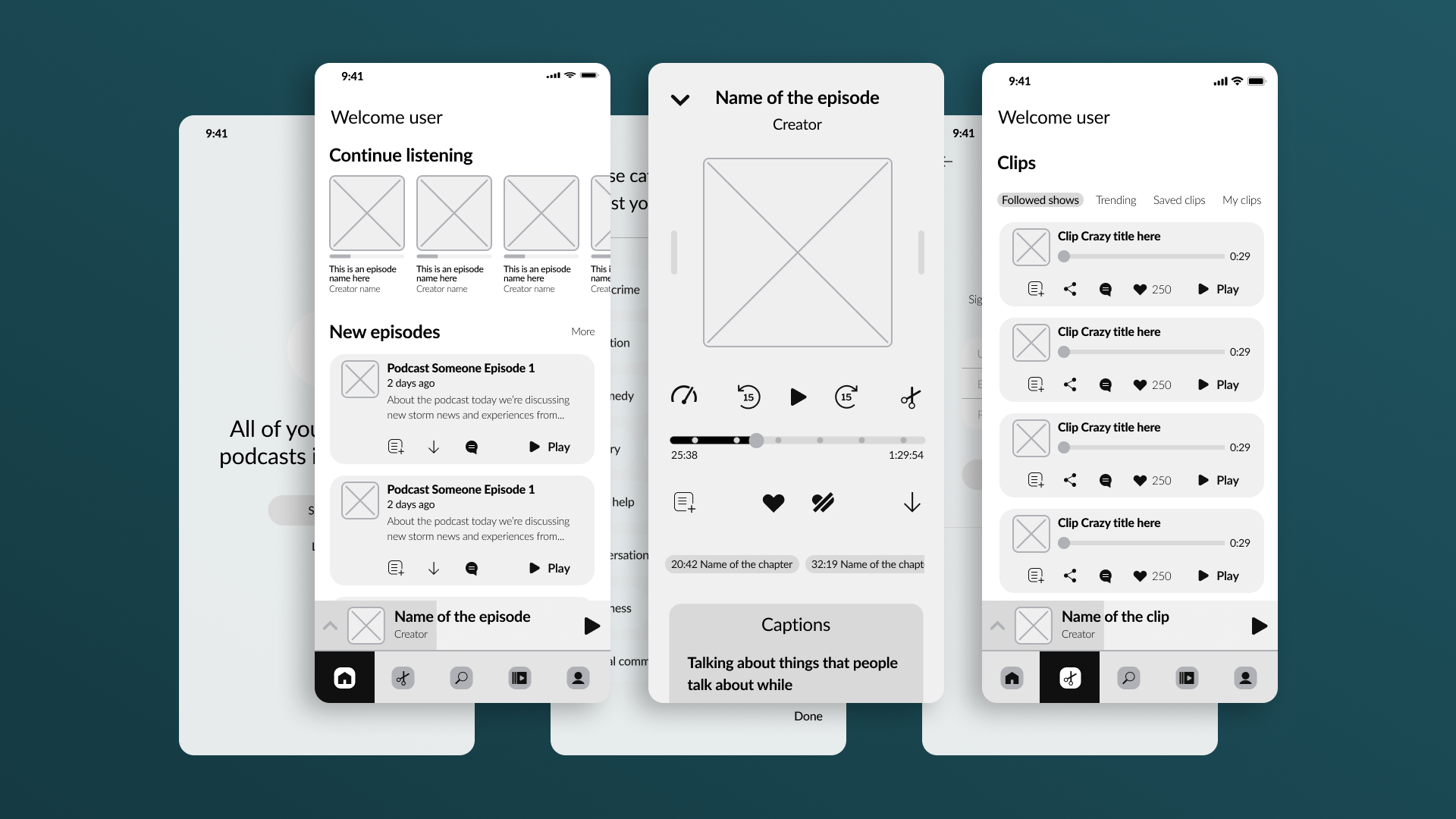
Following the IA diagrams, we developed a wireframe prototype, which we later used to test the app's flow and gather valuable usability feedback. The prototype included the main screens and a few secondary ones, enabling users to visualize the app's social features.
Usability testing
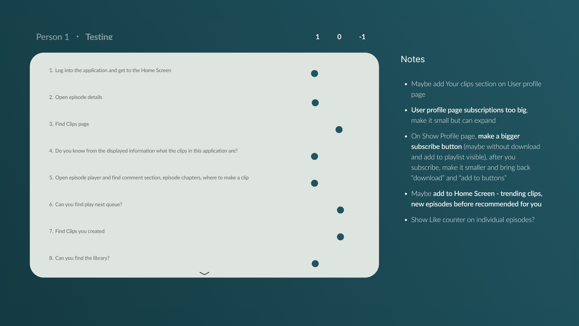
Testing results were recorded in a table for each participant. After testing, we aggregated all the results and documented everything that required updating or might need updating. The feedback was generally positive, with most of the necessary changes related to element placement and readability.
Colouring the "vibe"
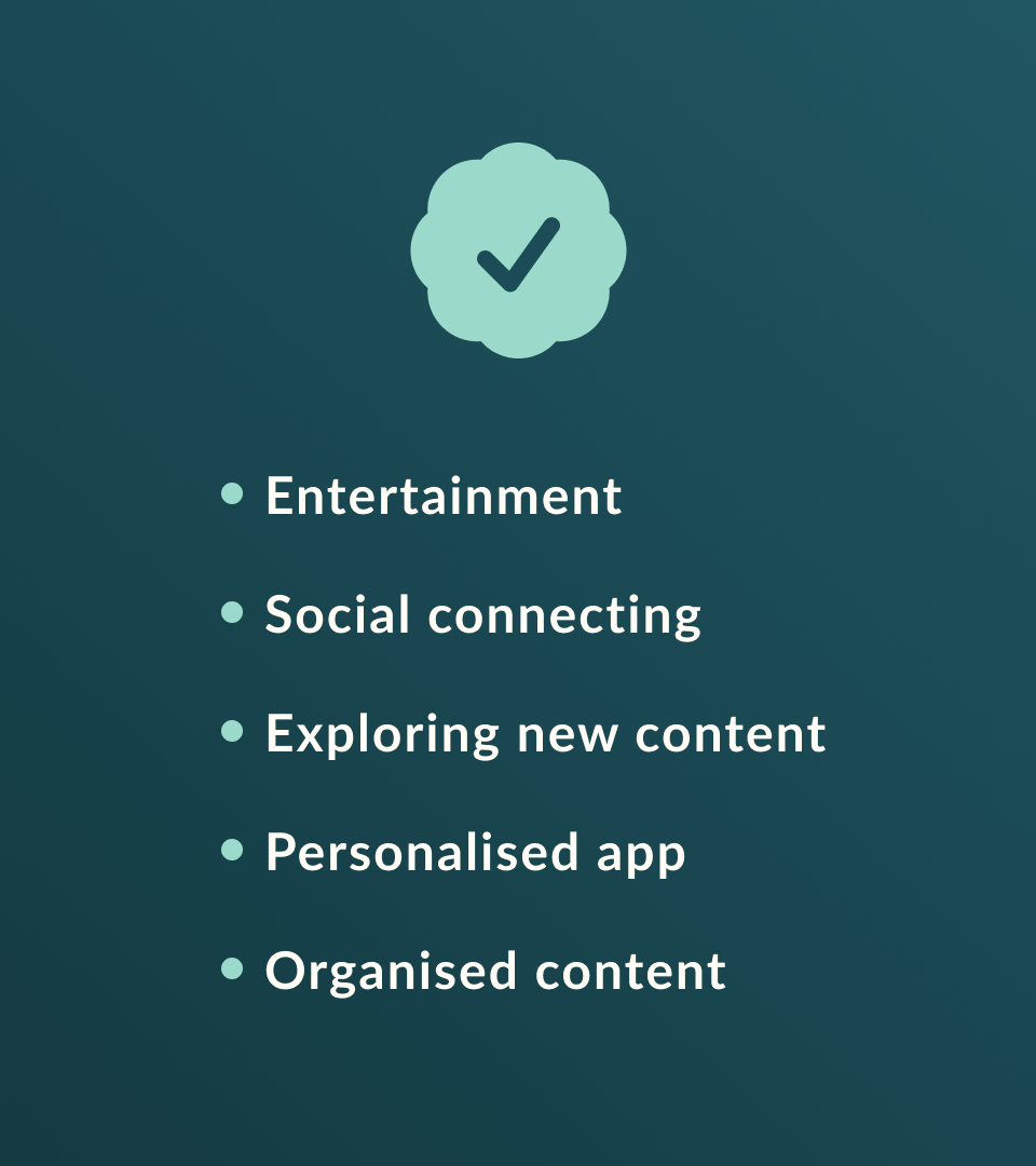
While brainstorming, our aim was to create a cozy and user-friendly experience for scrolling. Selecting the right colours would help emphasize important features in a unique and recognizable manner.Our main directions and goals were:
1. Keep it simple
2. Give it a modern look
3. Ensure comfort
4. Make text easy to read
5. Easy navigation
Not quite there yet
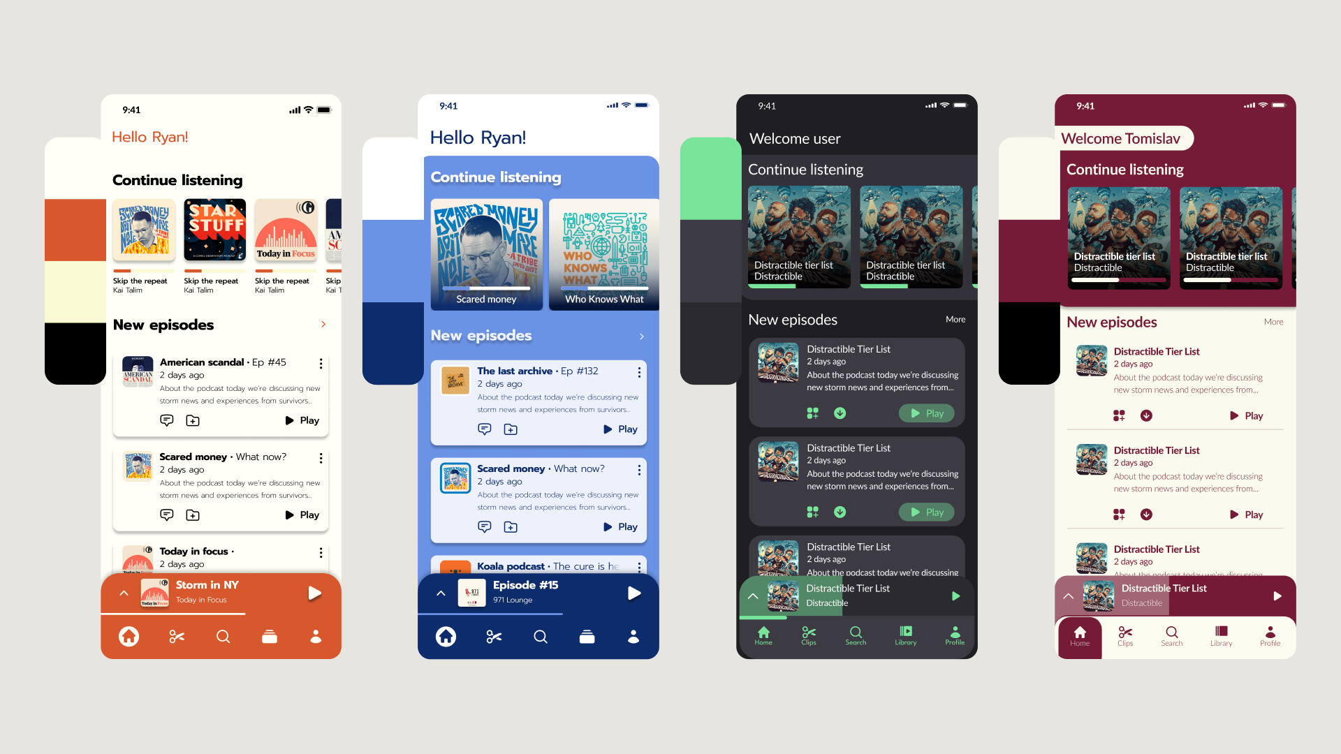
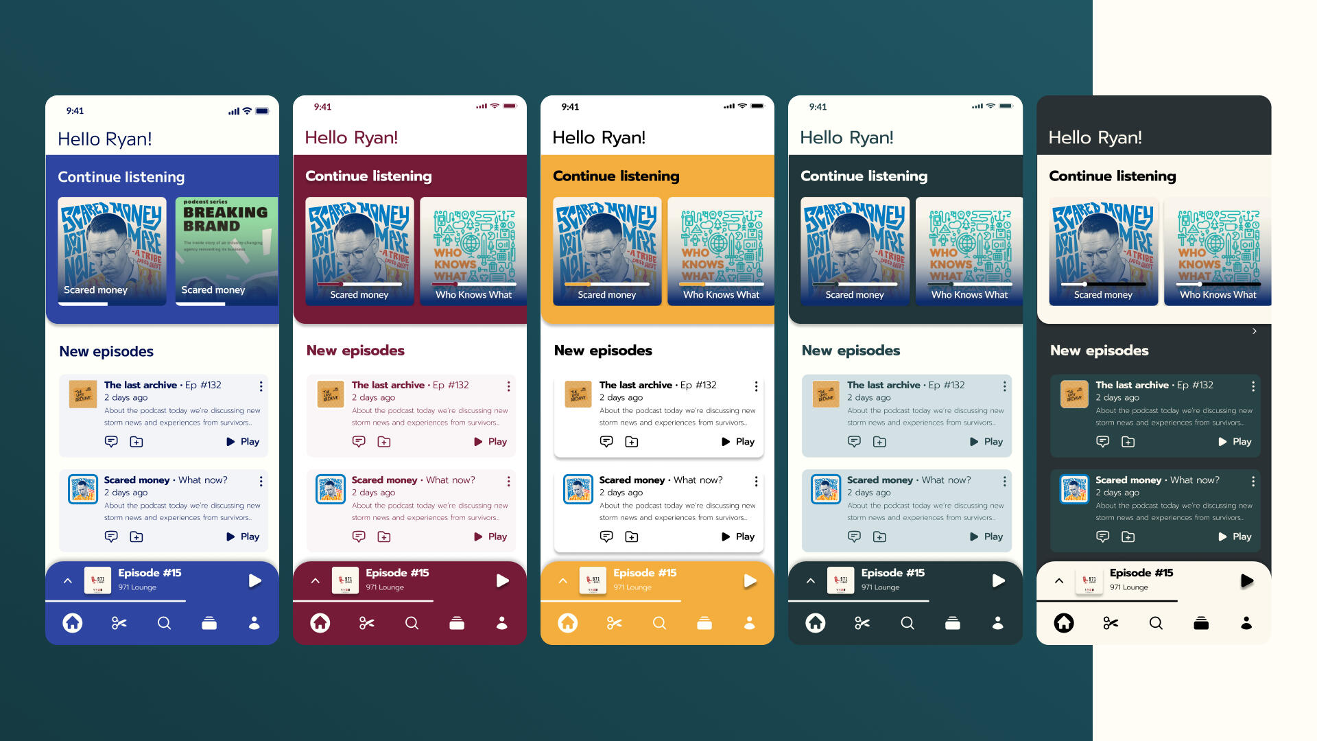
We had plenty of ideas, but we ultimately settled on a layout that is easy to navigate and provides all the necessary information for users as they scroll. However, the main challenge remained the choice of colours. We were certain that we wanted no more than three colours, as using more would make the app seem overwhelming and intrusive. These colours also needed to serve as guides for users, highlighting relevant information and sections.
This is it
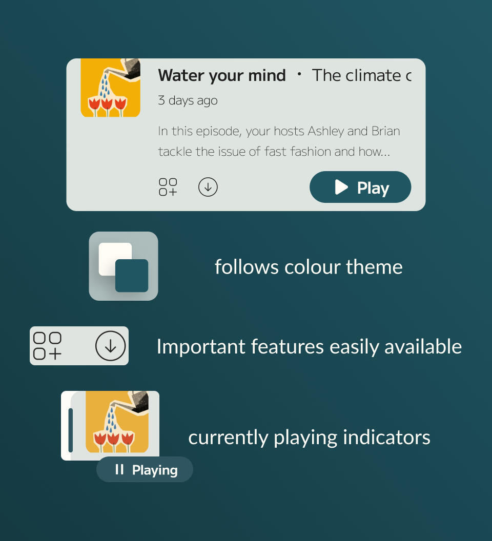
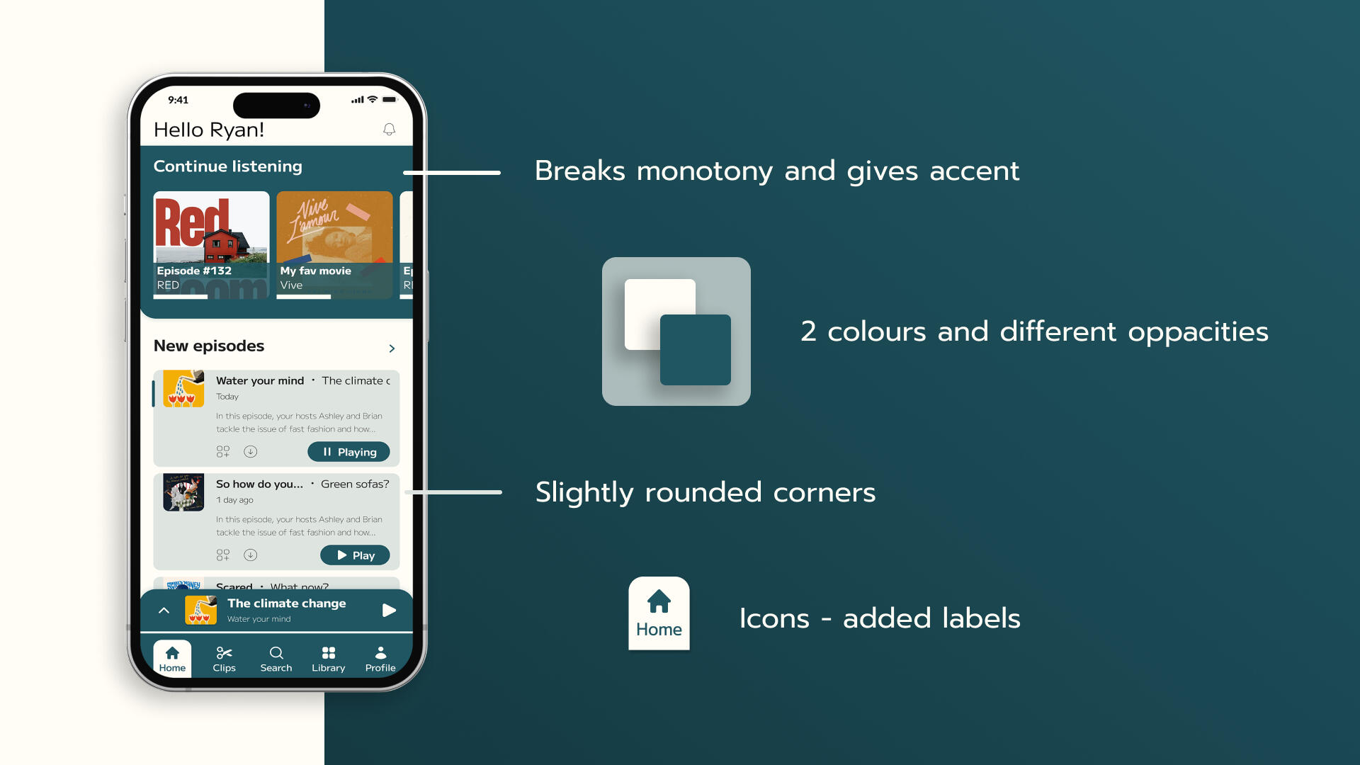
We decided on the final design, which would serve as the guiding vision for the entire app's design. The main colours were limited to two: a slightly off-white to convey friendliness and comfort, and a bluish-green to accentuate important information, break the monotony, and guide users. All information boxes would feature slightly rounded corners to achieve a modern and comforting appearance.
Homerun
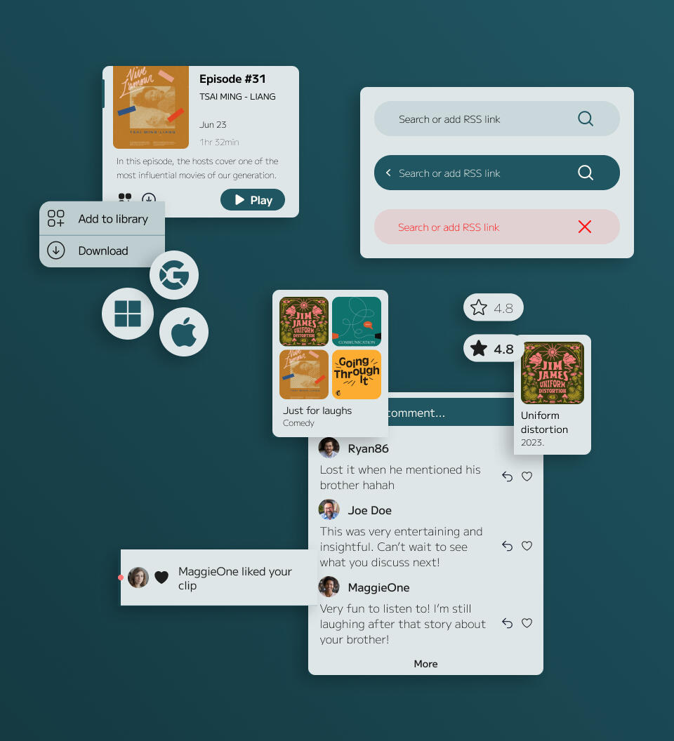
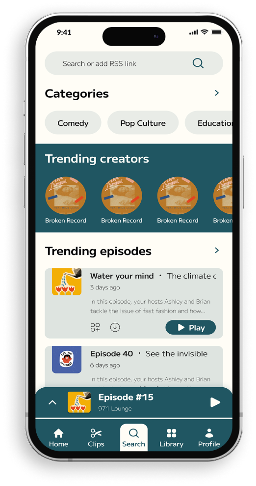
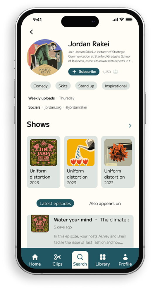
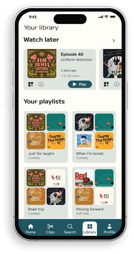
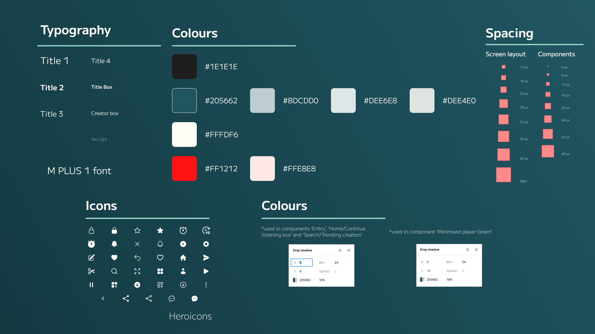
Following the design we decided on during brainstorming, the rest of the screens followed the same design principles. Component colours included the same white and green shades, with variations in opacity. Text was presented in black to enhance readability, and boxes, switches, buttons, and icons were rounded to achieve a modern and comfortable appearance while following the colour palette.
Specifications
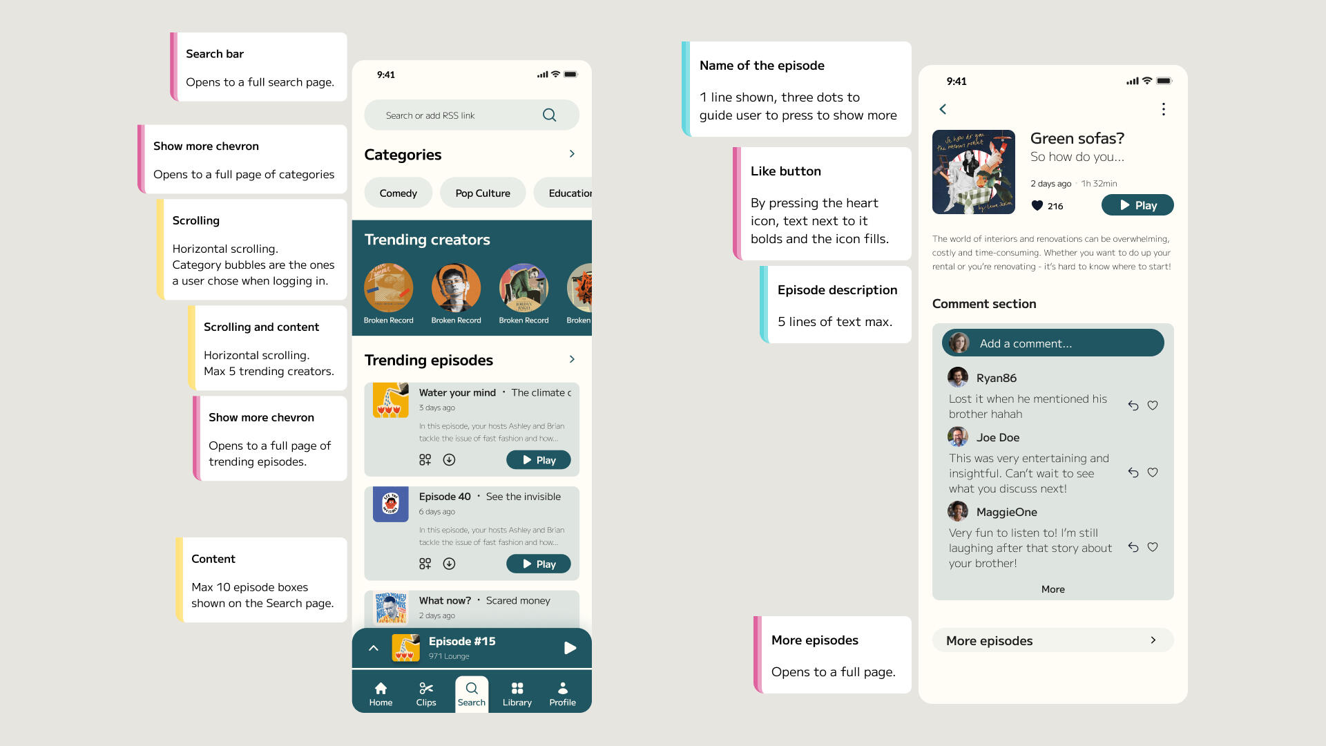
To communicate the requirements to the engineering team, we prepared a set of documentation. Additionally, we wrote descriptions of how the app should behave alongside each screen in the Figma prototype. These descriptions included instructions for button behaviour, bar movements, navigation bars, and more. We aimed to provide as much information as possible, but this final step remained incomplete due to the time limitations of the internship.
Bringing it all to life
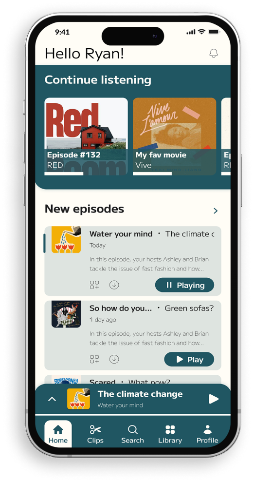
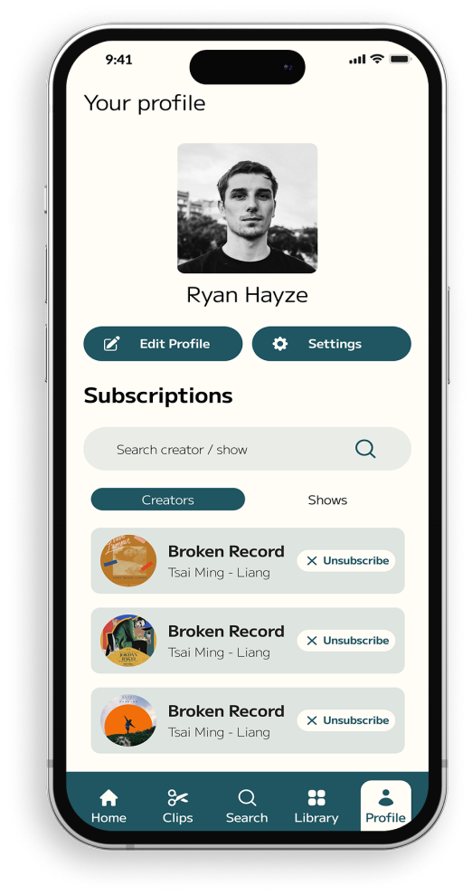
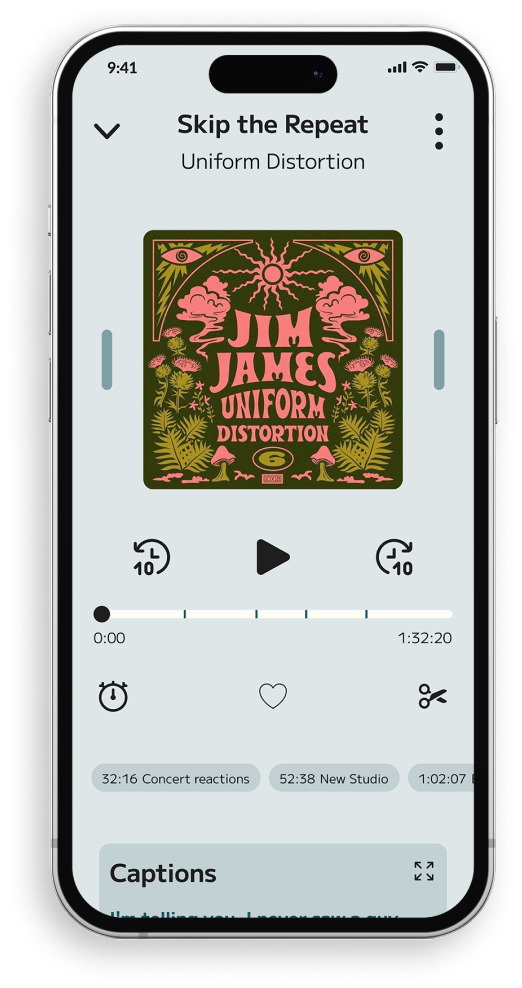
The gallery below shows some of the app designs for the IOS.
Clip sharing is easy
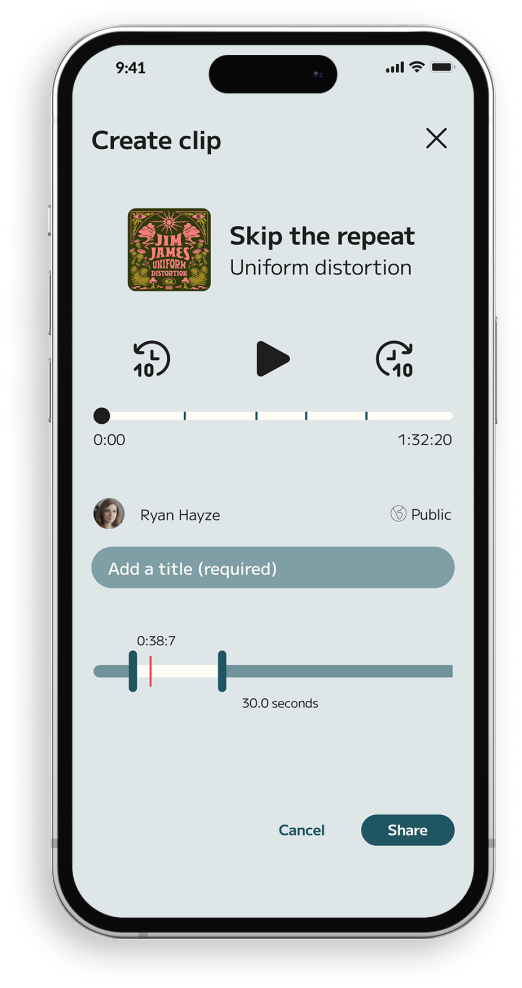
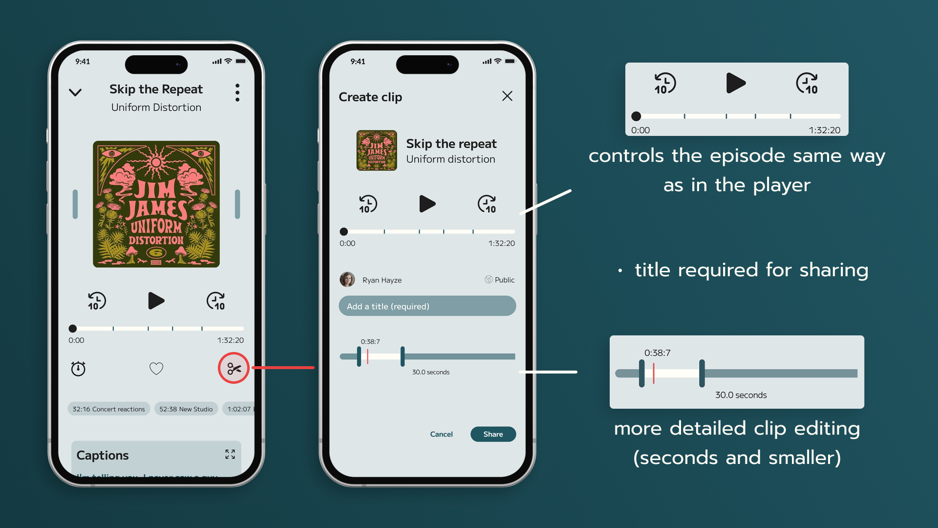
Creating a clip is very easy to understand. While listening to a podcast episode, any user can simply tap the scissor icon in the player, which will take them to the editing screen while the episode continues to play. The main episode controls are located at the top, allowing users to skip around to find the part they want. The bottom bar is used for precise editing, with a red line indicating the specific part they are currently listening to. After adjusting the clip length, all they need to do is add a title, and the clip can be shared with everyone.
What I learned
Preparation pays off
Creating detailed IA diagrams paid off greatly while developing the look and feel of the app. Whenever we felt lost, we would refer to our flow chart to determine our next steps. Clean wireframes, along with integrating some of the desired design elements into the wireframe components, also aided us in discovering the final visual identity we were seeking.By taking the time to prepare the components used for the app's design and functions saved me a substantial amount of time in considering their placement, spacing, and behaviour during screen design.
Whole internship was a great experience overall. It showed me what real work environment looks like. I learned what steps UI/UX designers follow, and how those processes look like when working on a project. I was thought how to effectively utilize Figma to achieve the final product and communicate with the team.

